Frontend Portfolio Site
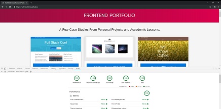
How meta right? Well when I was thinking of a project to revamp and add here to show a few of the optimization techniques I know of I thought why not keep it simple, I mean your already here right? As you can see from the picture, this page itself has a score of 100 in each of the categories lighthouse audits: Performance, PWAs, Accessibility, Best Practices and SEO. Don't take my word for it though, run the tests yourself by opening the chrome dev tools, going to the audit tab and click "run audits"! (psst: its 5x 100 on mobile too!)
- - Performance: Small scale site, good hosting environment and 0kb network payload on subsequent visits
- - PWA: Service workers serving up content while offline, defined manifest/styles and fast load time on 3G.
- - Accessibility: Color-wise, Attribute-wise, Naming-wise, Structure-wise and Metatag-wise.
- - Best Practices: A little bit of planning goes a long way.
- - SEO: mobile friendly, descriptive links, readable fonts and an all inclusive robots.txt .

AWS A.I. Services
This was a series of small projects done after I received my AWS Certified AI Practitioner cert
to better familiarize myself with the actual implementation of the services I had learned about.
The projects were done using the AWS SDK for Node.js and were designed to be run on a local
machine. The projects are not live as they require an AWS account to run but you can check out
the code in the repo below. The projects include:
- - AWS Rekognition: Amazon's recognition service. I used Rekognition's celebrity identification feature to make an app that scans a photo and returns information on famous people.
- - AWS Lex: The Lex service is for building chatbots. I used the traditional Lex service to build a bot that takes reservations at a fake game store.
- - AWS Polly: Amazons text-to-speech service. I built a demo app that does just that.
- - AWS Textract: This service can take images / pdf's and other docs and extract the text into different data formats. I built an app that takes a pdf and extracts the words.
- - AWS Translate: This service translates text from one language to another. I built an app that autodetects the language and can convert it to another that you select.
Cloudflare Developers Challenge
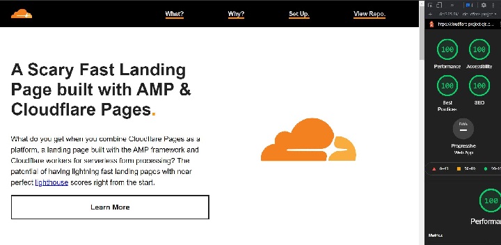
This project was done as part of the Cloudflare Developers Summer Challenge 2021. Participants were tasked with creating a project that used at least two technologies from Cloudflare's developer platform - for this project I chose Cloudflare Pages and Cloudflare workers. Cloudflare pages was used for static site hosting and Cloudflare workers was used for 'serverlessly' processing the form. I used AMP to code the page as Cloudflare pages is known for its speed and so is AMP. I had to customize the response headers a bit as AMP can be VERY rigid with its form processing rules and I used the SendGrid API to trigger an email on form submission that sends out a link to the repo on Github.
- - Cloudflare Pages static hosting on it's edge network uses facilitates continuous integration and deployment - it deploys straight from Github!
- - AMP helps keep the projects lighthouse score high.
- - The serverless contact form is processed by Cloudflare workers - features 0ms cold starts as well as local development and testing with the Wrangler CLI!.
- - Once the form is processed - uses SendGrid to send out an email with the repo link and triggers an asynchronous success / failure response for the user in the browser.
- - Couldn't really be less expensive - all operating on free tiers!
Shopify Polaris Project
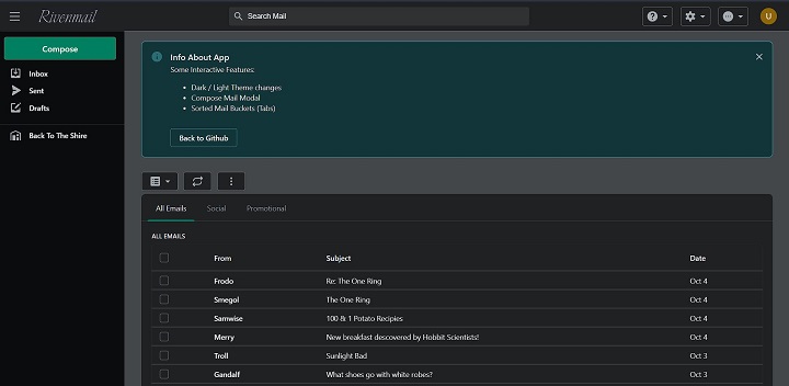
This project was undertaken in my spare time to get familiar with the capabilities of Shopify's
Polaris design system / React component library. I expanded the functionality of some components
in some places (the top bar), customized a few things (light / dark mode theme toggle) but
mostly used native functionality in order to get a general feel for the layout and styling that
is native to Polaris. I may go back someday and expand the functionality so that you can preview
"emails" but for now I accomplished what I set out to do. What did I attempt? The project was
"inspired" by the layout for GMail.
* Shopify has since developed a new component
library "Hydrogen".
- - Done using Shopify's dashboard component library "Polaris"
- - Toggle in the top bar between light and dark mode.
- - Modal popup to compose emails.
- - "Emails" are sorted into buckets dependant on the assigned type.
- - Dismissible info area tells you what the project is about or links back to Github.
Azure CMS Setup
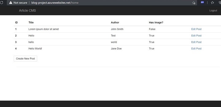
In this project that was completed as part of my Azure Developer Nanodegree coursework at Udacity I was given a Python / Flask CMS and tasked with deploying it to a webapp / managed PaaS service. First I had to add an azure SQL Server instance / Database for storing articles and users, then add a blob storage container for the article images and lastly I had to add 'Sign in with Microsoft' functionality through the MSAL, logging successful and unsuccessful login attempts. Although the project is not live (leaving some resources live in Azure = $) I have linked to a repo with some of the code (notably the MSAL implementation) as well as some screenshots from the project & a write up required that outlines some of the choices I made concerning the applications hosting.
- - Hooked up a SQL Server / Database instance in Azure to this CMS Framework provided
- - Got the application code up and running on a webapp instance (No more bare-bones server management and updates required!).
- - Implemented Authentication through the Microsoft Authentication Library (MSAL)
- - Logged successful & unsuccessful login attempts for security monitoring.
Headless Wordpress With React
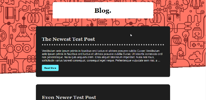
I started this project to experiment with WordPresses built in API. Having built quite a few WordPress sites myself and having worked on many more I feal extremely familiar with the back end dashboard of WP so using it for a headless CMS really appealed to me. This from scratch project is a barebones, two file, headless wordpress setup using react via cdn that should take only a minute or two to set up. Want to check out the two step set up of this project? Click here to read more about this project or take a look yourself with the "View Project" link below
- - React.js on the front end - customize the presentation all you want!.
- - WordPress on the back end (frontend data curtisey of the WordPress API)- the WP dash we all know for managing your data
- - Want to ditch the front end for something else? Want to keep the Frontend and change the backend to something better suited to new business needs? Be my guest! The modular nature of a headless CMS means you don't have to start everything from scratch if you want a change - you can just adjust it to fit a new front or back end.
- - Designed to be a <5min install using CDN's for React.js and Babel.js with only 2 pages to add to a classic WP installation
Express.js / Passport.js
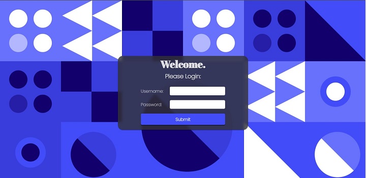
This was a project I did so long ago I don't remember if it was part of a tutorial, blog post or if I was just going through the documentation but here it is. This project uses the express-generator boilerplate and implements basic / local user login through passportjs, checking a flat file repository / 'database' for user accounts. I know the account info is in the Repo here (which I wouldn't normally do) but as they are fake accounts it doesn't matter in this extremely specific case. I also used a frosted glass CSS effect because I really wanted to use it in a project - I've since used it in production applications and I STILL think it looks cool.
- - Reads then stores user info through sessions in an encrypted cookie with HttpOnly flag.
- - Once logged in redirects user to personalized welcome page based on role ('/welcome')
- - Implements a basic protected route. ('/protected') only available if logged in as an Admin level account & a modular general routes file which any logged in user can see.
- - Profile page ('/profile') reads your account info (name) once logged in.
MWS Capstone Project
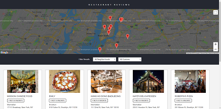
This web app was designed to be mobily responsive, have a high degree of accessibility and runs on a nodejs development server provided for me in my completion of a Udacity Mobile web Specialist Nanodegree, competed for and granted to me as a scholarship from Google. With a backend hosted on Heroku and a front end on Netlify it has many of the trademark features of Progressive Web Apps, such as (After the initial page-load / API calls:):
*This DB for this project is set up on Heroku's free tier and is spun up after loading. You will need to reload the page a few seconds after opening it to load data. It's also ephemeral so it won't save your choices for longer than a few hours.
- - The DOM content loaded at .107s and a total page load of .5s
- - A service worker serves content to any pages previously visited, even when offline.
- - Restaurants and Reviews are stored in a browser based database (indexDB) so they load regardless of issues with internet connectivity.
- - The review form checks for a connection - if one is not found, it defers and stores form data until re-connection then sends it along as a JSON object.
- - Once a favorite is toggled, it sends info to the API to keep it persistently marked as such.
Azure Microservices
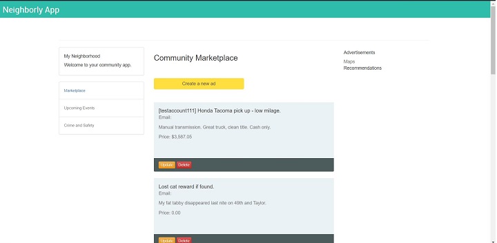
This project was completed as part of my Azure Nanodegree from Udacity. We were given a Python Flask-powered web application and asked to deploy to an Azure apps instance, create a backend in Azure functions, set up a MongoDB database, Dockerize the backend functions app then set up and deploy it to a Kubernetes cluster running in Azure. The project was designed to get us more familiar with setting up applications using a Microservices application structure. The app itself is not online (too costly to keep running all the time) but you can check out the repo here with plenty of screenshots to see it in action.
- - Azure Functions App API connected to Azure CosmosDB / MongoDB Database through 7 http triggers
- - Client side Python / Flask app deployed to app service
- - Dockerized 'Serverless' functions API deployed to Azure Kuberneties Cluster
- - The application allows the user to view, create, edit, and delete the community advertisements.
- - Azure logic app watches for Http trigger and sends email notification when a new topic is added to the site.
Blogging With Jekyll!
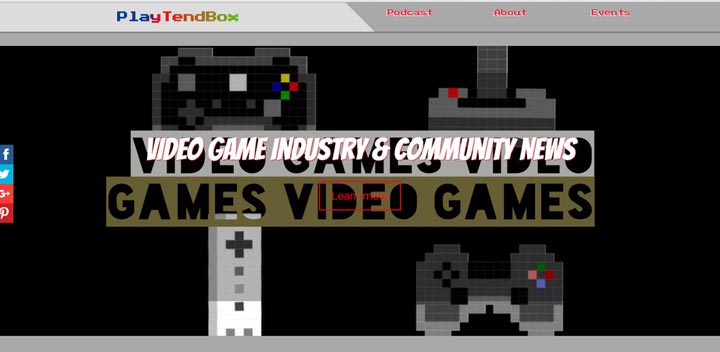
When my brother needed a blog for his video game podcast, I saw it as the perfect excuse to learn to use Jekyll. Jekyll is a html template engine that uses markdown syntax for to easily create blogpost and is easy to learn, even for non technically inclined people. The best part? You can host and update Jekyll blogs on Github for free! *Sidenote, please don't hold me responsible for any of his content ':/
- - Installing, Setting Up and Configuring A Jekyll blog.
- - Jekyll Uses The Liquid Templating Language To Bring Partials Together Into A Working Site.
- - YAML Front Matter Blocks Followed By Markdown Formatted Content Can Easily Create New Static Post Pages Without Touching The HTML.
- - No CMS Or Database Needed! Github Acts As A Defacto CMS, And No Database Means Fewer Chances For Errors To Occur.
Google MDL 2.0
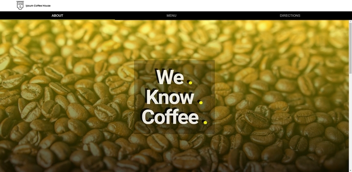
This project is an updated version of an older project listed below. I referb'd this project to turn it into a Progressive Web App, Adding a service worker to cache all requested resources. Why? TLDR: so it can still work offline. Want to know more - I wrote up a whole thing on it! Check it out by clicking "View Project" below:
- - Designed Around Google's Material Design Specifications.
- - A Framework Focused On Design!
- - Faaaast! After a fairly small initial pageload, subsequent visits can take under half-of-a-half-of-a-second to load!
- - Load it once and its cached - the page, the assets, the external assets - everything! Once you visit a page you can revisit, even if offline.
Gatsby / Woocommerce
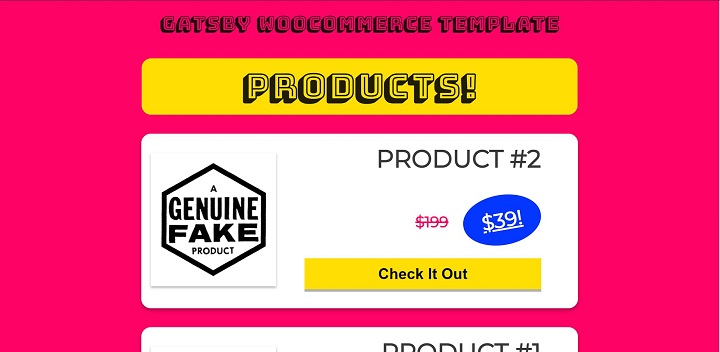
Although WordPress can be a wonderful platform for making complex & feature rich websites all those features can have a high cost. If you are a developer that wants to set clients up with a familiar & easy to use backend they can log into but a fast, static more secure (i.e. decoupled from the database) frontend Gatsby is a great choice. A Gatsby frontend on your WordPress site alleviates the need for the complex caching strategies that WordPress needs to be performant and enables developers to use the tooling they are familiar with. Here is a proof oc concept I undertook that uses a WordPress backend with Woocommerce installed and generates a static frontend in Gatsby.
- - Wordpress backend creates an admin area clients are familiar with and provides features you would normally need a third party integration for in a stand alone static site.
- - Woocommerce is installed so just add a product like you normally would, run gatsby develop and static product pages are generated for you.
- - Easily populate page data with GraphQl in the Gatsby page template.
- - Easily set up continuous integration / delivery (CI/CD) pipelines: you can keep your Wordpress install on a separate domain for added security!
FCC Exercise Tracker
This fullstack project was done as part of obtaining an 'Back End Development and APIs' certification from FreeCodeCamp.org. This project involved writing an API in Express that would serve as the backend for an exercise tracker application. Users can create an account then log exercise info such as descriptions, dates etc. then request either a complete or a partial copy of their info back. All of the info is kept in a MongoDB instance running in Mongodb Atlas - MongoDB's Cloud offering - and Connects using Mongoose.
- - Users can create a new user profile and get an ID number in response
- - The API can provide an array of all users on request
- - Using their user ID, users can log exercises providing a description, duration and optionally a date
- - Users can then get a list of exercises they have entered - retrieving either their entire exercise log or just a part by submitting a date range.
TailwindCSS
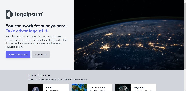
TailwindCSS is self described as a "utility-first CSS framework" - what's that mean? There are utility classes that can facilitate just about every layout you could think of. Tailwinds enables you to build a page "without ever leaving your HTML" to create opinionated, aesthetically pleasing designs - I think of it as the next evolution of Bootstrap, or at least a branch that viers more towards developer workflow than previous popular CSS design systems. Tailwind also fits in nicely with frontend librarys like React - it's inline css utility classes can be used in components to maintain a D.R.Y. CSS approach. This is the results of a tutorial I undertook offered directly from TailwindCSS to learn the basics of TailwindCSS and how to use its native utility classes, extend to new classes, sprinkle in React and create an optimized build for production.
- - Uses Vite for frontend tooling - reloads browser for changes, extensible through plugins and produces optimized builds.
- - Uses PostCSS to automatically add browser prefixes to CSS classes to maximise cross-browser compatibility.
- - Customize your own classes within Tailwinds, extending native functionality so you don't have to spend a lot of time coordinating with a seperate CSS file.
- - With minimal configuration, PurgeCSS gets rid of any unused CSS classes minifying your CSS files to contain no superfluous classes.
A.M.P. Local Landing Page
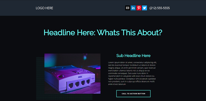
Google has spent a lot of time and money into researching users and have decided that, guess what, users like fast websites. Googles Accelerated Mobile Pages (A.M.P.) specification was developed with speed and a smooth, non-jittery page load in mind. According go Google: "Faster landing pages typically lead to more conversions" and "Landing page experience is an important factor for your Quality Score and Ad Rank". What does that mean? Not only are your users more likely to convert but with a higher Quality Score your PPC Ads will rank higher - leading to better possible page position and cheeper overall campaign costs! This project was undertaken to create a boilerplate of BowlerHats "ideal local landing page" just because I wanted to test out some of AMP's components. Read more in the projects repo by clicking below.
- - Googles AMP pages are FAST! Especially when served from the AMP cache which is free for amp pages.
- - AMP specific dynamic features are designed to reduce on load times and render blocking scripts while still offering interactions users are used to.
- - Testimonial sliders, Maps, Social Media buttons and other landing page staples are all possible within the AMP framework.
- - Ad campaigns can have higher conversions with a higher Ad quality score resulting in a higher R.O.I. and lower C.P.A.!
URL Shortener
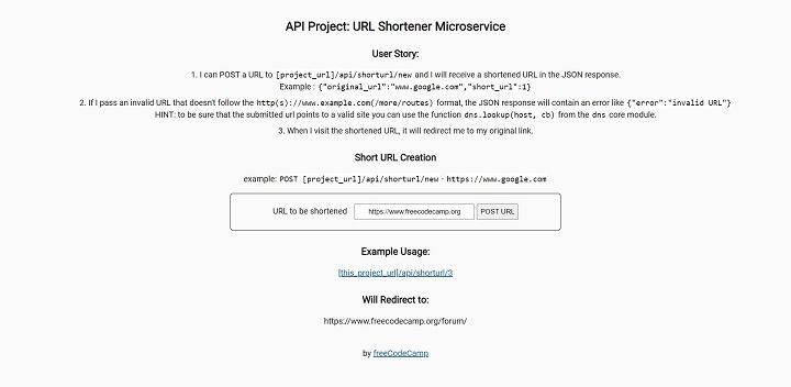
This is another project done as part of obtaining an 'Back End Development and APIs' certification from FreeCodeCamp.org. I wanted to get this cert to further practice and reinforce my ability to use Express / Mongodb together and thought this certification seemed like a fun way to do it (which it was!). I was given the project specifications listed on the homepage of the project and asked to build the project up to meet them. This project is a URL shortener - the user enters a url and gets a shortened url back. This is done by parsing the url from a POST request, matching it to a url pattern and checking it is a valid address against a DNS store, adding it to a MongoDB instance hosted on Mongo Atlas using the Mongoose driver, then returning a shortened url. When the user looks up that url it looks up the address using the shortened url and redirects to the original.
- - Express.js is used to create the API and process route requests.
- - Mongoose is used to connect to the MongoDB instance running on Mongo Atlas and read / insert data.
- - Users can submit a url and receive a shortened url back.
- - Users can visit the shortened url and will be directed to the original link.
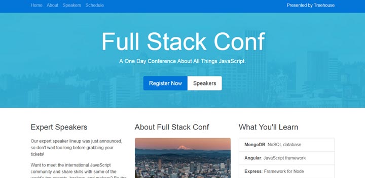
Bootstrap 4
Bootstrap 3 Is Twitter's widely adopted mobile first framework for laying out and styling content on the web quickly and responsively. The upcoming release of Bootstrap 4 adds some new features as well as some changes to older legacy functionality. This project was done to familiarize myself with the upcoming specifications for the Bootstrap 4 Framework.
- - New Intuitive Syntax For Legacy Twitter Bootstrap 3.0 Features
- - New Utility Classes For Content Layout & Spacing
- - New Component Classes
- - New Ways To Layout Forms And New Custom Form Controls
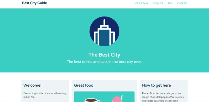
CSS3 Layouts Using Flexbox
Can we finally admit that some CSS layout techniques are a bit of a hack in that they were developed using styling in a way it wasn't really intended for? Good. Now that that's over and flexbox specifications have been stabilized a bit more we can move on to using flexbox for layouts like I have learned to do while working on this project here.
- - Accessibility Friendly Content Ordering! You Can Finally Re-arrange Content Independent Of The Markup! This Is Great News For Screen-reader Accessibility Fanatics.
- - Controlling Container Spacing And Element Alignment (Vertical Centering Too!)
- - Navs, Cols, Sticky Footers, You Name It! Flexbox Can Simplify Many Previously Tricky CSS Based Elements.
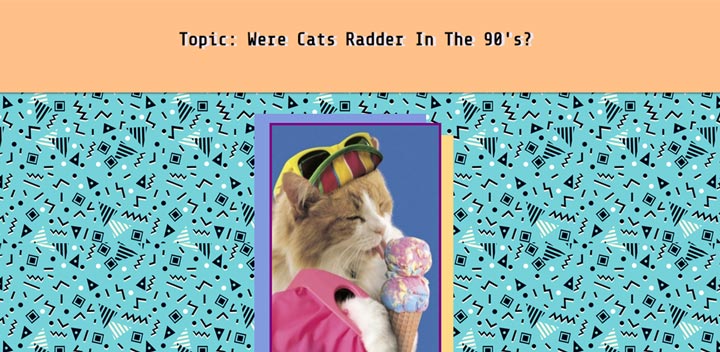
Google AMP
Google's new Accelerated Mobile Pages specifications are, in a way, a throwback to 90's web design adapted to bolster user experience in matters concerning modern mobile web surfing. In this project I familiarized myself with some of AMPs specifications and capabilities.
- - Embedded styles, Predefined Image Size And Extremely Limited JavaScript Usage Make For An Extremely Fast Mobile Experience.
- - AMP Pages Link From, Not Replace, Your Traditional Pages To Increase Your Mobile Users Experience.
- - You Can Add & Configure AMP Extensions For Common Elements But With Speedy, Lightweight, Mobile Friendly Functionality.
- - You Can Easily Check Page
Validation By Adding "
#development=1" To The End Of An AMP Page's URL!
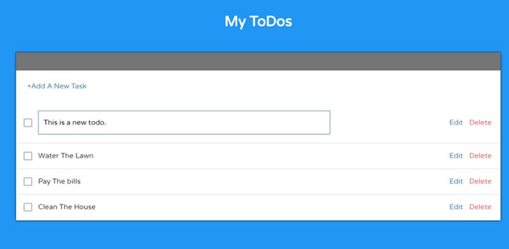
Angular App
Angular is Google's flavor of JavaScript MVC frameworks used for quickly developing single page web applications. In this project I familiarized myself with the declarative nature of developing within the Angular framework and learned more about client side application frameworks in general.
- - Filling A Template/View With Data Using (Scoped) Controllers And Directives!
- - Making Common Tasks Easy With Angulars Built In Directives Or Make Your Own Custom Ones!
- - Using Services to Request, Update And Create New Data.
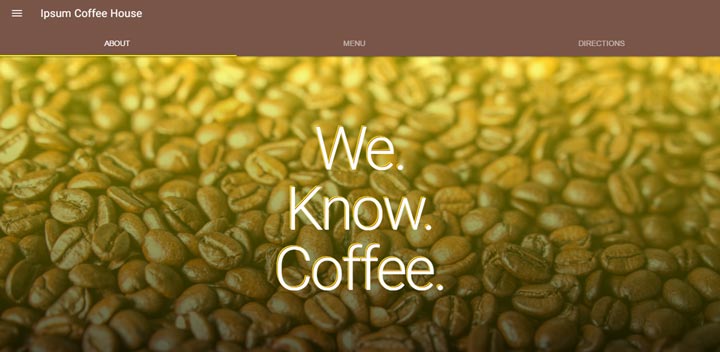
Google MDL project
Google Material Design Specifications are out alerting designers to Googles preferred and recommended design specs. After reading through the Material Design specifications I wanted to use what I had learned in a project and luckily I found a framework that would allow me to easily do so! I chose to do this project in Google MDL (Material Design Lite) because it was designed in close co-operation with Googles own Chrome UX and Material Design teams. This framework is even used in some of Google's own properties!
- - Designed Around Google's Material Design Specifications.
- - A Framework Focused On Design!
- - Site Created In A Mobile Mindset.
- - Styled Elements Like Cards And Nav-bars.
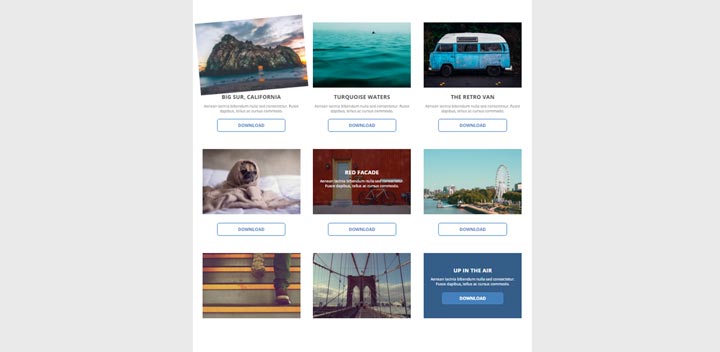
CSS3 Transitions and Transforms
Transforms and transitions are designed to "delight" the user, give feedback based on interactions and provide information on element states. CSS3 makes it easy to add interactive elements to webpages without bloating markup with unnecessary JavaScript
- - Control Animation Transition Timing, Speed, And Delay.
- - Scale, Translate, Slide And Position Elements.
- - Increase User Interaction With Site Using Pleasing Responses And Visual Cues Based On User Actions.
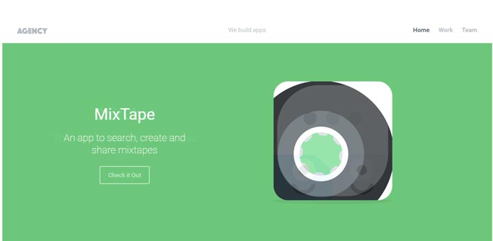
Websites With jQuery Plugins
jQuery is a powerful library for adding cross browser compatible interactive features to your sites, but what happens when it fails to have a feature your looking for? You could write it yourself, but an even easier, quicker option is to use high quality well supported jQuery plugins. In this project I learned to do just that.
- - Selecting Well Supported, High Quality jQuery Plugins With Easy To Understand Documentation.
- - Incorporating And Configuring A Plugin For A Simple Full Page Animated Transition Between Pages.
- - Using Plugins To Add A Sticky Navigation Bar.
- - Using Plugins To Crete A Carousel To Display The Sites Main Features
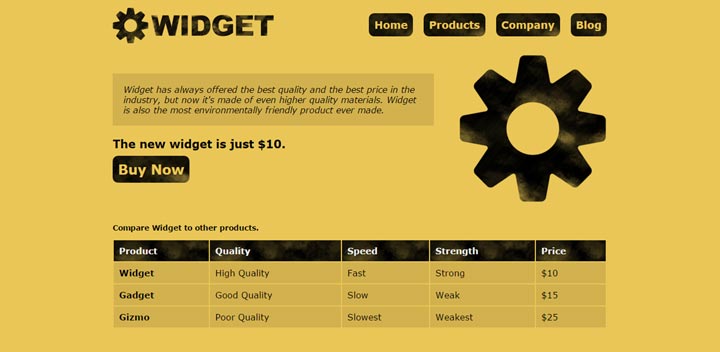
Website Accessibility Concerns
As the Internet of things expands accessibility concerns become more and more important. As people become more dependent on the web for important tasks, information dispersion and entertainment hearing, vision and mobility concerns need to be addressed. In this project I continued my education concerning some of these issues.
- - Hi Contrasting Colors To Aid With Some Color Impairments
- - Screen Reader Friendly Content For Some Vision Impairments
- - Accessible Markup For Forms, Tables And Other Data Presentation Tools.

Gettin Sass(y)
The Syntactically Awesome Style Sheet Language Describes itself as "CSS With Superpowers" and although I love the cleaver things you can do with CSS, I agree the options SASS adds can supercharge the organization of your CSS. This project was fist done as a refresher on CSS layout and styling techniques, and then re-factored to get used to using the Sass CSS preprocessor.
- - Setting Up A SASS Environment
- - Using Partials And Imports To Organize Code
- - Using Variables & Mixins To Make Code Even DRYer
- - Identifying Common Code Patterns For Reusable Mix-ins With Arguments That Dynamically Alter CSS Values.
- - Defining outputted CSS formatting for optimization during development & production.
